|
Text Effects. You see them used on websites all the time. They help make the website owners message stand out more, and come to life. In an assignment we had in our electronic media class at the University of Utah, our Professor Linda Ralston had us create various versions of different style texts that we might use on our websites. Whether it be for a heading or just to use as an example. The lesson she designed was meant for us to demonstrate our ability to create a creative text image using 4 different styles, and 1 warp text effect. As you can see in my photo gallery below. The warp one can be used as a headline for my photo gallery. This was done by simply going through the directions step by step. Here's how I created it. Step 1: Create a New File (400x100 pixels, RGB, Transparent background) Step 2: Create your unique color. Select the color box at the bottom of the tool bar and click on what you would like your foreground color to be, then hit the "ok" button. Step 3: Select the type of font you would like to use. Be Creative! Step 4: Select your font size. Use a font that is 30+ Step 5: Type your name and then the purpose it'll be used for. For instance, my says my name and then Photo Gallery. Step 6: Go to the top of the tool bar and click on Layer, then scroll down to Layer style. Play around with the different layers, and see what works best for you. Add multiple, you don't just have to have one. Experiment with different styles, drop shadows, etc. It's as simple as Steps 1-6. You want to remember to be creative. It seems everyone try's to stay safe and keep the text limited to Times New Roman, or Cosmic Sans when they are trying to be fun and spice things up. As my Professor Linda Ralston said to me in regards to this assignment, "Typography, the art and science of typefaces, is one of the most important aspects of web design and has roots in print and graphic design dating back to the 15th century. Yet despite typography's rich history and undeniable importance, many designers continue to pay little attention to it. There is a gross misconception that typography is simply font choice." I believe that she completely right when it comes to this matter. Albeit, it is important to be bold and step out of our comfort zones to create amazing texts, it is also important to keep in mind simplicity always wins. If you get to crazy, you could get a negative response. Perhaps the text is too bold, or moves too much making people dizzy. You want to be careful in your choices, and apply them to recent trends, and what people are into currently, and remember that typography is not just about your font choice. It's about leading, kerning, color choice, layout, and the overall integration of the design.
0 Comments
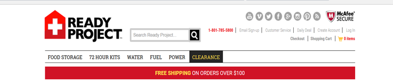
 AIDA Model AIDA Model A,I,D,A, What is it good for? Good marketing doesn’t come easy. To capture an audience, you need to grab their attention and keep it. It’s the root of AIDA (Attention, Interest, Desire, Action) philosophy, which is often referenced when building a website and solidifying a marketing message. The Ready Project considered each of these elements in the design of their site. Let’s break it down: A – Attention: This is set to attract your consumer’s attention. The first thing you notice on The Ready Project’s site is the clean design, and bold, eye catching colors. Their branded logo and tagline is front and center and memorable. The product and value is immediately apparent.
I – Interest: This is the overall interest of your site viewers/customers. Prominent discounts and offers pay off the initial attention. The page is informative, without being overwhelming. The navigation is clean and encourages you to explore the site and its offering
D – Desire: You need to be able to sell your customers on the fact that your website and products that you offer are exactly what they need and want. This element seems like less of a priority for The Ready Project, as it’s catering to a niche audience that are likely already in the market for food storage—their products are not exactly impulse purchases, but rather investments. In that regard, their value propositions focus more on promotions and product specifications and descriptions. The ability to order food samples and product videos go a long way to make the product more desirable not only to regular customers, but first time visitors.
A – Action: This is the point where your customers take action by investing, and/or purchasing your product. Not only should a site to deliver a clear call to action, but it’s also important to make the site experience and checkout as seamless as possible. The Ready Project does that. Through ease of navigation, prominent promotions, and a quick checkout process, the site makes it easy for customers to take action.
 Live Life Ready Best Practices #1: Search-abilityThe success of your website relies heavily on how easily it is for your viewers/customers to find your web page. In order to get people to visit your site, you need to be able to be found easily, and the way to do this is by making sure you implement the following:
Best Practices #2: Design When it comes to designing the layout of your website, a key point to keep in mind is, Less is more! As Antoine de Saint Exupéry said, "It seems that perfection is attained not when there is nothing more to add, but when there is nothing more to remove." Many of us can get carried away when it comes to designing our own websites. White space scares a lot of people, and they don't want to leave anything out. However, you need to be careful and not overload your site viewers with too much information, and too many photos, designs, that it looks too busy and overwhelms their eyes so much they need to shut it down. My advice would be to focus on the need to know information, and add in your own touch, but keep it simple, don't overdo it. Add just enough to keep their interest but leave them wanting to know more. For example your navigation bar shouldn't have more than 8 options in my opinion. If you need 10 that's fine, but the more you can whittle it down, to say 5-6 the better off you'll be. This way, your site viewers stay focused on where they need to navigate to in order to find the correct information they are looking for. Best Practices #3: FunctionalityFunctionality is extremely important in a website. It's how you do things on the website. Keep in mind, site viewers not only want this but expect it to be this way upon their first visit. Here are a few things that if you want your website to be functional you might want to keep in mind.
Best Practices Bonus: AIDA AIDA is an acronym that is commonly seen used in advertising, and the marketing field.
 Search Engine Optimization |
Abigail L. Bliss
Sports enthusiast who has over 15 years of customer service experience, over 10 years of administrative work, along with over 4 years of photographing and filming sporting events. Currently working as a Marketing and Project Coordinator, while finishing my Bachelors degree in Community Recreation and Sports Management. Archives
December 2015
Categories |
 RSS Feed
